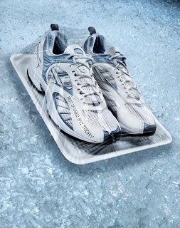
Recently I worked on a project with photographer Bob Stevens, (www.bobstevens.com), that was pretty fun. For me it started with a call from Bob seeking input on how to tackle a particular challenge. You see he was bidding on a job for Kaiser Healthcare and this one image involved shooting a pair of running shoes that were packaged up like a choice steak at the grocery store complete with foam tray and plastic wrap.
The challenge was how could he shoot a few different sets of shoes on the foam tray, get them combined to create a “generic” shoe and then have it all wrapped in plastic wrap.
After thinking about it for a little while I took one of my own shoes and did a couple of quick shots of it with and without plastic wrap and then looked at them carefully to see if I could figure out an approach.
Then it occurred to me, since the wrap is essentially clear it basically showed up in the image as subtle shadows and highlights depending on how it interacted with the light. But each of these qualities also had a certain kind of ‘organic’ look to it so while I could just paint in the shadows and highlights I’d have to be careful to match the way the stretched plastic really caught the light.
So the solution I offered to Bob was simple: Shoot the different shoes without the wrap and then shoot some examples of shoes wrapped in the plastic so we had some good ‘organic’ examples, (otherwise how would we know when it looked “real”). Then all we needed to do was build the generic shoes by compositing bits and pieces and finally I’d illustrate the wrap onto the composited shoes. Easy, eh?
On the day of the shoot Bob had his crew along, with the Art Director, Marge Bornais, and I all meet at the studio. While Bob and his assistants shot the various pairs of shoes I started “comping” together the shots working to build a lo res version of the generic shoes. When every one was confident we had this part covered we moved on to shooting the plastic wrap examples.
To make sure the wrap showed up as well as possible Bob had a pair of black shoes standing in as the hero shoes. Then Bob and his crew shot somewhere between 30 and 40 shots of the plastic wrapped shoes. As they went along they realized that with the reflective nature of the wrap they needed to concentrate on shooting bits at a time. One shot might have a great look over the toes and another have a good highlight over the heel. As they went along the Marge and Bob circled the areas they liked and passed them on to me.
Finally it came to assembling everything together in high resolution for the final ad. First I worked on combining the parts of the shoes to build the generic shoe. When everyone was happy with the new shoes I started working on adding the plastic wrap.
Marge had a great insight oserving that the wrap added some slight darkening effect overall. So first I added a curve that darkened the shoes and the tray just enough to define a shape for the illustrated wrap.
Then I opened up the shots of the plastic wrap and studied them closely. It became pretty apparent that the wrap had a subtle shadow, a more diffused highlight,S and then a sharper, hotter highlight on top. Basically this is the same way you illustrate wrinkles in fabric. I decided to approach it by making a series of layers, one to darken slightly, one to lighten a little and another one for the hotter highlights.
After working that out all I needed to do was to trace the various shapes we liked from the sample shots of wrapped shoes and copy those shapes to the various layers I had made in the hi res file and fill them in with the right color of paint. Sliding the opacity of these layers gave me the control I needed to make sure they had just the right transparent quality.
With Marge and Bob art directing me as I went I then took the shapes I made and gave each one a few tweaks to get them looking good. When that was done I then went around the edge of the foam tray illustrating little wrinkles along the way to complete the illusion.
The final step was to work with Bob and Marge to adjust the overall color and saturation getting the “Feel” Bob was after.
Easy as pie.
Here is a before/after of the base shoes and the final wrapped composite image.


