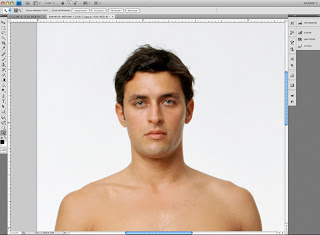
Sometimes we get lucky. Every now and then there is actually one of those “Quick and Dirty” tricks that actually works and saves us hours of extra work. Depending on the shot “Channel Pulling” is one of those tricks.
Basically the idea here is if one of the channels in the image shows enough contrast between your subject and the background you can make a quick mask based on that channel and save yourself all the work of having to hand paint the mask.
Here’s how a quick run down on how it works. First let’s take an image like this one I got from Jupiter Images. You can see this is just a basic shot of a person against a white background. While this technique can work with more complex images I just wanted to use an easy example to get the idea across.
The first step is to go to the Channels palette and look at each of the channels in the image. This one is an RGB image so we’ll look at the Red, then Green and finally the Blue channels to see which one offers the best contrast between our subject and the background.
Looks like the Blue channel is our best bet so we’ll use that one. Next we’ll click on that channel and pull it down to the folded page icon in the menu at the bottom of the palette. (Ahhh, now you know why it’s called “Channel Pulling”!) This makes a copy of the channel called “Blue copy”.
Now click on that channel in the palette menu to select it and see it on the screen.

Looking at this channel we can see that it needs a little work to be useable as a mask. Remember that you need a mask that is mostly black and white with just a little gray in between them to soften the edge and make a good transition between our subject and whatever the new background will be.
Obviously this means we need to add some contrast to the channel so we can push most of the gray values to black while making sure the rest is truly white. My preferred method for adjusting the contrast is with the “Curves” tool. You can get to the Curves adjustment by selecting Image>Adjustments>Curves from the menu, or by using the shortcut Command + M (sorry, I always have trouble remembering the PC equivalent).
Once we bring this up the adjustment itself is pretty easy, just slide the black point (in this window it’s on the lower left) over towards the right until you see the grays start to fill in to black. Then slide the White point (it’s the one on the right) over to the left until the lighter grays turn to white.

It’s good to note that you want some shades of gray around the edges. Since Black and White are the extremes shades of gray give us some feathering around the edge. How much feathering we need all depends on the image itself. As I noted in a previous post the right combination here depends on how crisp or soft the edges in the image itself are. You want your mask to have a similar amount of crispness or softness as your image. Here is a close up view of the bits of gray I’m using to feather the edges of this mask.
Now the next step is to fill in the areas that need to be black but aren’t quite there yet. Depending on what seems easiest I’ll either use a big brush to paint it in, or use the lasso tool to select those parts and then fill them with black. The same thing goes for any areas that really need to be white.
When you’ve completed this you should wind up with something that looks like this:

And now that we have our mask channel made all we need to do is turn it into a layer mask. Doing this is really simple. First make sure your layer is not set as the background layer. (Background layers cannot use layer masks.) If it is all you need to do is double click on it in the Layers palette. With this done now load the channel we just made as a selection. Again I like to do this by command clicking on the channel’s icon in the Channels palette but you can also use Select>Load Selection from the PS menu as well.
With the selection loaded look to see if the crawling ants are running around the outside of the image. Since by default White in the channel indicates the area that will be selected the channel we made will mean the background gets selected instead of the subject. No worries, all you have to do is choose Select> Inverse from the menu (Command + Shift + “i” on a Mac). This flips around the selection and now your subject is selected instead of the background.
Then the last step is to go back to the Layers palette and click on the little “Add layer mask” icon at the bottom of the Layers palette. Here’s a screen shot of it:

Now we have our layer mask and your image should look like this and you’re ready for the next job. (Don’t forget to Save your image.)


