
A recent discussion on ASMP’s email list touched on creating realistic shadows so I thought I’d post a quick tip here describing one of my favorite ways of creating realistic shadows when creating composited images in Photoshop.
The most important things to remember about creating shadows are: 1) Proper shadows tend to be subjective – imagining what the perfect shadow looks like will drive you nuts. Everyone will have a different idea of what looks right. 2) Studying real light and shadows will help you ‘see’ what a realistic shadow looks like more accurately, making your subjective opinion just a little bit better bit by bit.
When painting a shadow it also helps to remember that ‘real’ shadows tend to have different parts. If the object casting the shadow is resting on something (like the ground) it will tend to have a core shadow right where it lands on the ground. And there will be a softer, gradating shadow as it blocks the light from hitting the ground.
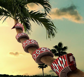
The image above is from a series of images I worked on with photographer Richard Radstone last year. In this particular one of the challenges was to wrap the accordion around the palm tree. That particular task generated my first tutorial on the website, www.psd.tutsplus.com, which can be found here: http://bit.ly/3YEVfT
And of course after wrapping the accordion around the tree it needed to have some shadowing added to make it look like it really belonged there which brings us back to the topic at hand.
Adding the shadows involved creating 2 layers, one for the core shadow, and the other for the cast shadow. In this case I used the Multiply blending mode for both shadows because I like the way the colors of the shadows blend more naturally with the objects in the image.
The way the colors of the shadows blend is very important because shadows do have their own color and this is affected by the color of the ambient light and the color of the object the shadow is landing on. Using the Multiply mode while sampling ‘real’ shadow colors tends to work pretty well for me.
So for these shadows I sampled a darker color from the palm tree and experimented with a few strokes before deciding on a final color. Remember the darker the color the stronger, darker your shadow will be – but you can easily adjust that with the opacity of your shadow layers.
After settling on the right shadow color I made one layer, called it “Core Shadow”, set the blending mode to “Multiply” and then using a smallish brush I painted along the area where the accordion was touching the palm tree. To keep this shadow layer from splashing over onto the sky I clipped it to the palm tree’s layer as a clipping group.
After painting the core shadow I then made another layer set to Multiply blending and called it “Cast Shadow”. Then I used a much larger brush and painted in the softer cast shadow keeping in mind the shape of the accordion and the direction of the light the accordion would be blocking to cast the shadow.
To get the gradating effect of the cast shadow you can either use a low opacity brush and build up the strokes closer to the object, or use a layer mask, or use the Eraser tool (set to a low opacity) to erase it away until you’re happy with the result. I alternately use all 3 methods at times depending on what strikes my fancy that day.
The point here is that the shadows are painted with 2 layers, one for the core and one for the larger cast shadow. By making them independent I can then play with the opacity of each one and use the Move tool to nudge them into the right place if needed.
Using this method I’ve found it’s much easier to create shadows for everything from accordions on trees to vitamin bottles on white. Simple eh?


Brilliant and yet so simple. Too bad you're on the left coast, you would be a great guest speaker for my packaging design class. In the meantime, I'm going to give this technique a try and see if I can achieve a result remotely close to yours.